Tuesday, October 2, 2012

Museum Websites


PROS:

  • The sidebar tells you what things are going on now at the museum without the user even having to click anything.
  • When you click on a link at the top of the page and it takes you to that page, the left sidebar shows all the links that were sub-links you saw when you hovered over the main link so you don't have to hover over the main link again to see what else was written there.
  • Links are organized in a consistent and easy to understand way

CONS:
  • Birthday parties link might go better under events instead of education


PROS:
  • Hours of operation are on the home page
  • Main links have a drop down list but also a picture with the link to the main thing you are probably looking for in that particular menu
  • Different information is clearly separate from each other


PROS:
  • It is simple
  • The 3 main links are highlighted with a picture
CONS:
  • Some of the pages are just long lists of information
  • The links don't have a drop down menu to tell you what all is included in that link


PROS:
  • It repeats the main links at the bottom of the page

CONS:
  • Doesn't show or list the supplies that are carried


Tuesday, September 11, 2012

P1 Event Info


Artwork by Amanda Wilson.
April 18, 2013 Thursday @ 8 p.m. Concert Hall

The Pirates of Penzance, one of the most popular comic operas of all time, is a treasure-filled musical extravaganza teaming with dazzling damsels in distress, rugged rogues and swashbuckling pirates! Follow the fortunes of Frederic, who has been mistakenly apprenticed to the Pirate King. Now completing his 21st year of indentured service, he rejoices in his freedom. His dreams are dashed when his leap year birthday (February 29) is discovered, which means he must serve for another 63 years! A tempest begins to brew and mayhem reigns when Frederic falls for the lovely Mabel, the daughter of the “very model of a modern Major General.”
Ticket prices: $11–$12. Reserved Seating. Advance tickets can be purchased online, by phone or in person at the Forbes Center Box Office (Mon.–Fri., 10 a.m. to 5:30 p.m. or 1½ hours prior to performance). Cash, checks, major credit cards, JACards accepted.
JMU student tickets: Advance tickets — $8 discount tickets in person at the Forbes Center Box Office only with ID. One ticket per ID. Student tickets are not available online. Cash only 1½ hours prior to performance.
Mailing Tickets/Will Call — Tickets that are ordered more than two weeks in advance of a performance will be mailed to the address on file. Ticket orders received less than two weeks prior to a performance will be held for pick-up at Will Call at Wilson Hall Auditorium.


Photo by Richard Finkelstein
March 21–23, 2013 Thursday–Saturday @ 8 p.m.
March 24, 2013
Sunday @ 2 p.m. Mainstage Theatre

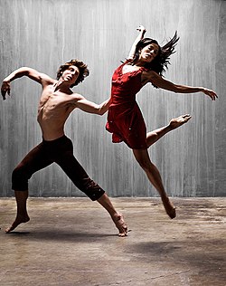
Featuring the best works developed by students during the year, this concert is a catalyst for launching future careers in dance! Come support these breakthrough artists perform jazz, ballet and modern works, as well as a work by guest choreographer Julio Agustin Matos, Jr. inspired by the late, infamous director-choreographer Bob Fosse. The program will also feature the premiere of new works by JMU dance faculty members Cynthia Thompson and Shane O’Hara.
Ticket prices: $13–$14. Reserved Seating. Advance tickets can be purchased online, by phone or in person at the Forbes Center Box Office (Mon.–Fri., 10 a.m. to 5:30 p.m. or 1½ hours prior to performance). Cash, checks, major credit cards, JACards accepted.
JMU student tickets: $11 in person at box office only with student ID. One ticket per ID. Student tickets not available online.
Mailing Tickets/Will Call — Tickets that are ordered more than two weeks in advance of a performance will be mailed to the address on file. Ticket orders received less than two weeks prior to a performance will be held for pick-up at Will Call at Wilson Hall Auditorium.

Project 1 Mood Board


Asgn 4

Resume

Laura DeBusk
1010 Woodbury Circle
Harrisonburg, VA 22802

Education

Experience
Currently working towards:

BFA: Graphic Design at James Madison University

  • Minor: Dance


  • Designer for Hypeculture 2012-present
  • Student Assistant in James Madison University Political Science Department
    2011-present


Commissions


  • Noah's Arc custom welding business card 2012
  • Hypeculture logo/identity/promotion 2012-present
  • St. James Street Children's Church logo 2012


Contests Won

  • Spread Joy Give Hope t-shirt design contest 2012
  • World AIDS Day t-shirt design contest at James Madison University 2011

Shows

Truth & Tranquility: Life-size Human Transformation Drawings and Works from the French Mediterranean
James Madison University's ARTworks Gallery February 2012


References available upon request
Email me

Tuesday, September 4, 2012

HTML Email Research

The Scholarship Points email doesn't have a very eye-catching design.  There's a bunch of block text that makes it not something you want to spend time reading.


This design is fairly simple but it gets its point across. Abebooks makes sure that you know that their highest priorities for textbooks are that they're cheap to buy, fast to get, and easy to find.


The problem with this design is that there isn't a clear hierarchical scale.


This design while it does have a lot of text, has a nice balance with the alternating images and the names of the designers bolded so if you're skimming the text you might stop and actually read if you recognize the name.


A hierarchical scale is very evident in this design. Adobe wants the viewer to focus on his chance to be better a teacher while at the same time saving money.


This other design by Adobe is advertising the same product as the ad above but in a different format. It does a good job of using the golden rectangle.


This html email does a good job of using the grid structure.


I think that the block of text in the corner should have been moved down a little bit so that there's not tension at the corner with the rectangle that runs diagonal, but the font works well with the image.


There's a clear grid structure, hierarchy, and the text is broken up into small pieces so it's easy to read, and with every block of text there's a link to click on to give you further information on the subject.


Michaels' design is much more fun than most html emails. They use color to differentiate between information and make it clear that you'll save at their sales.